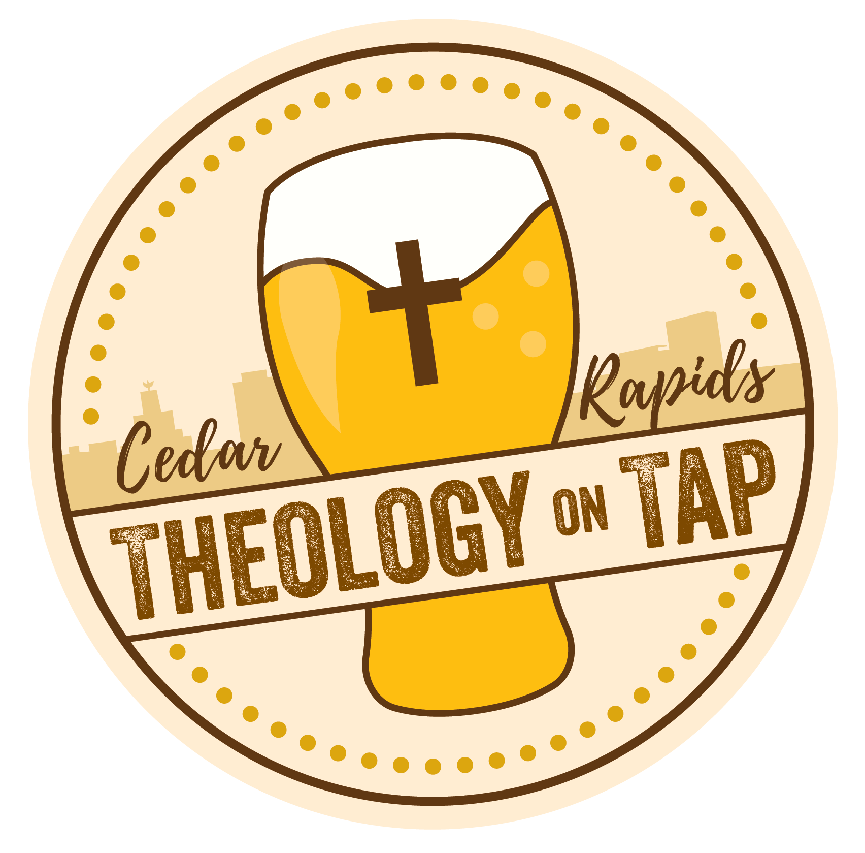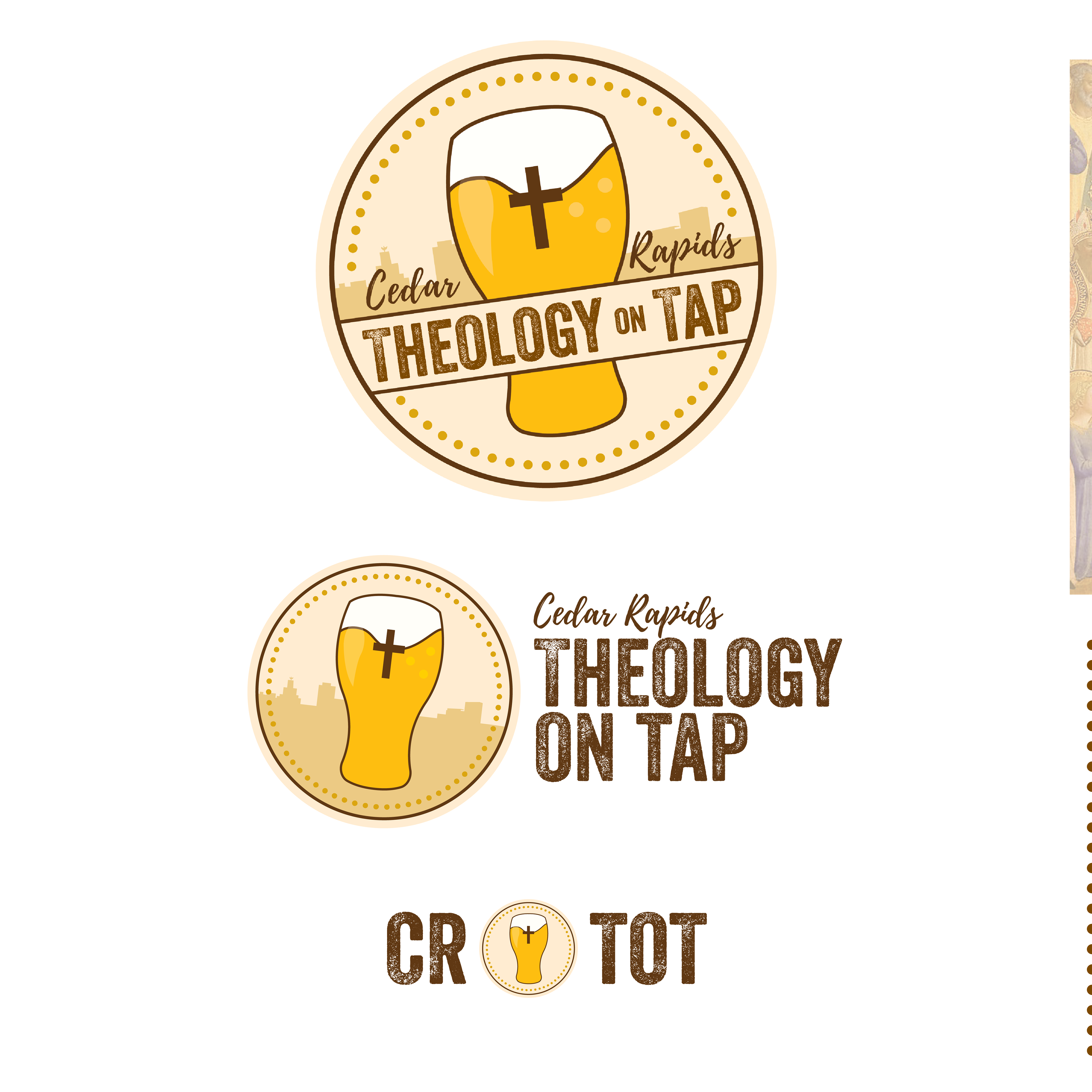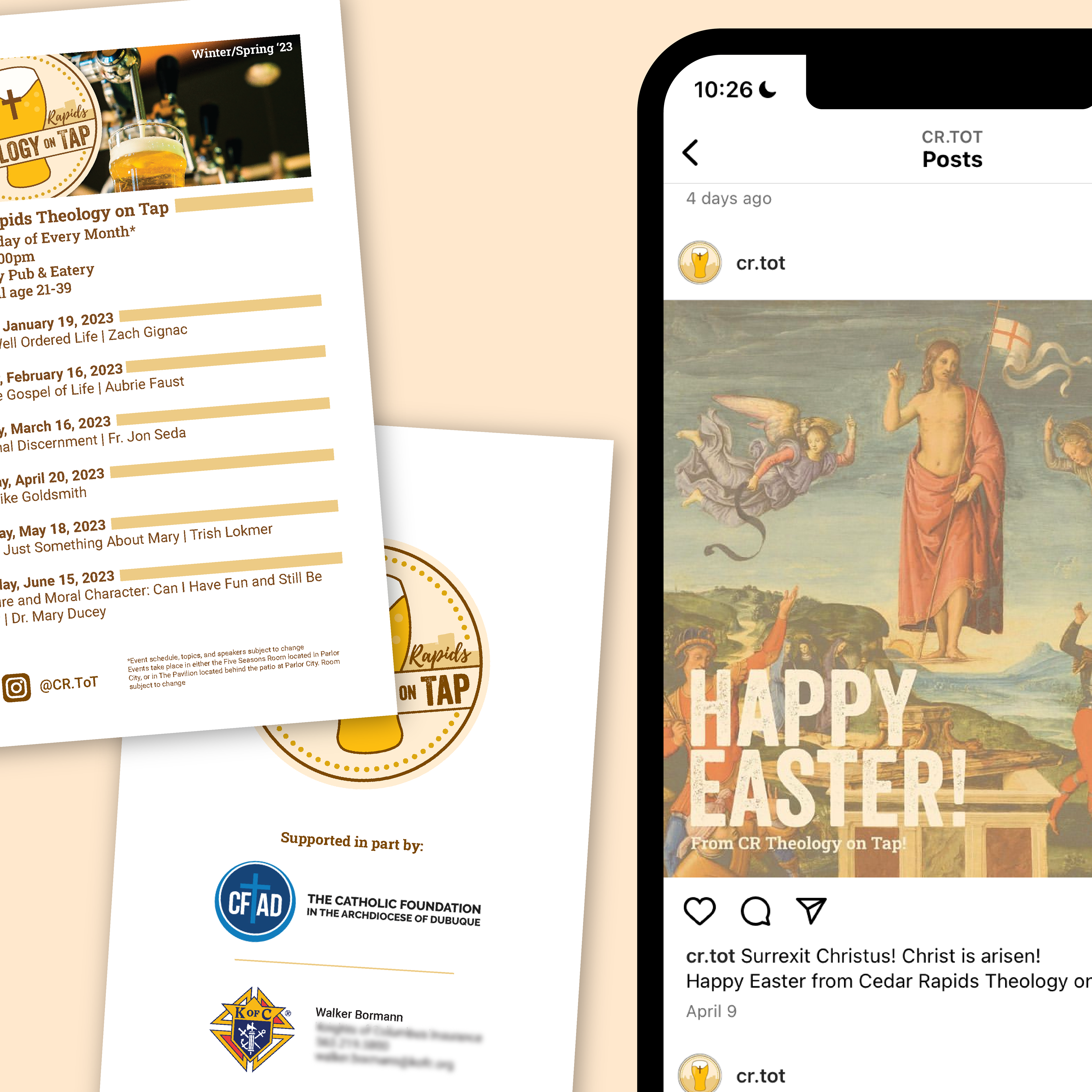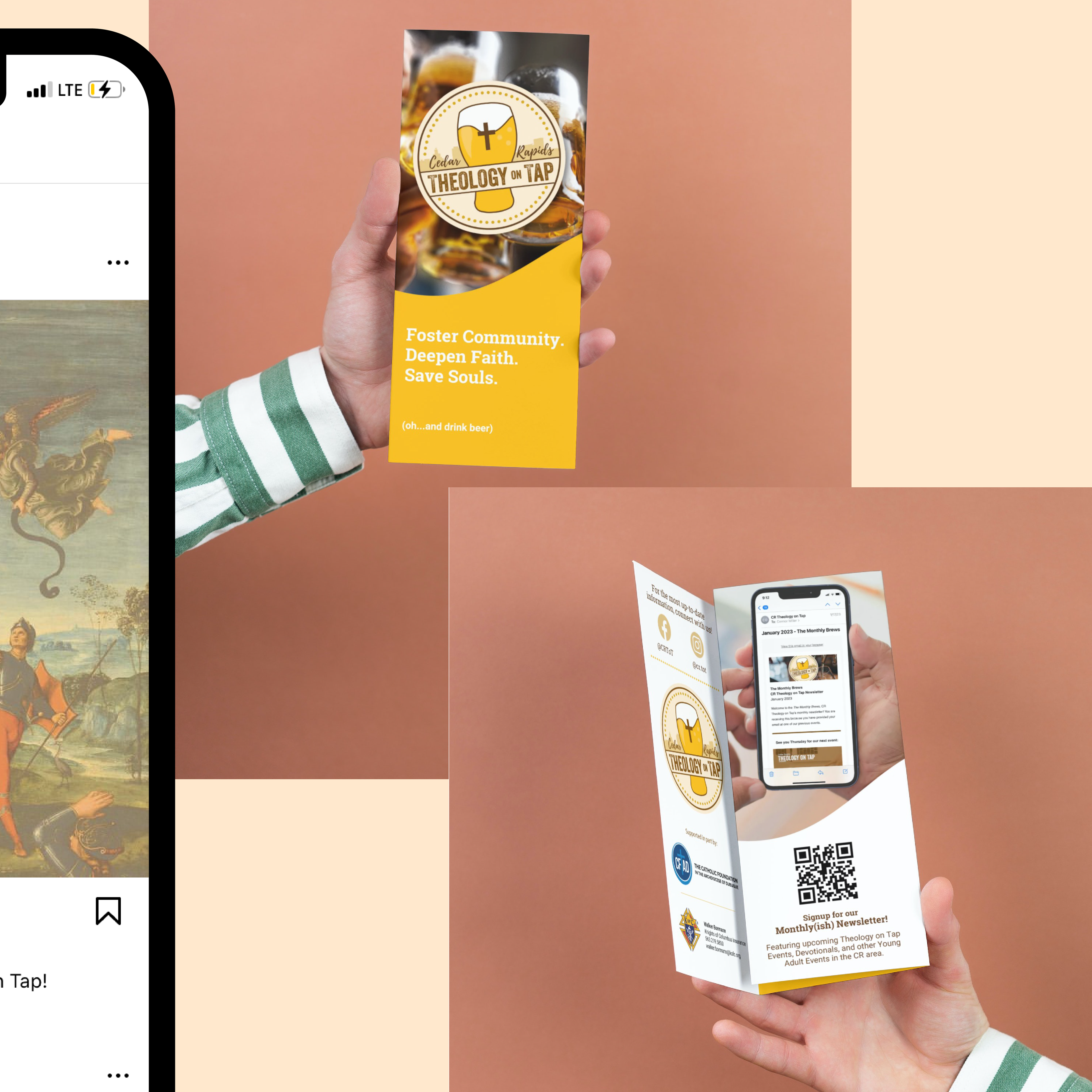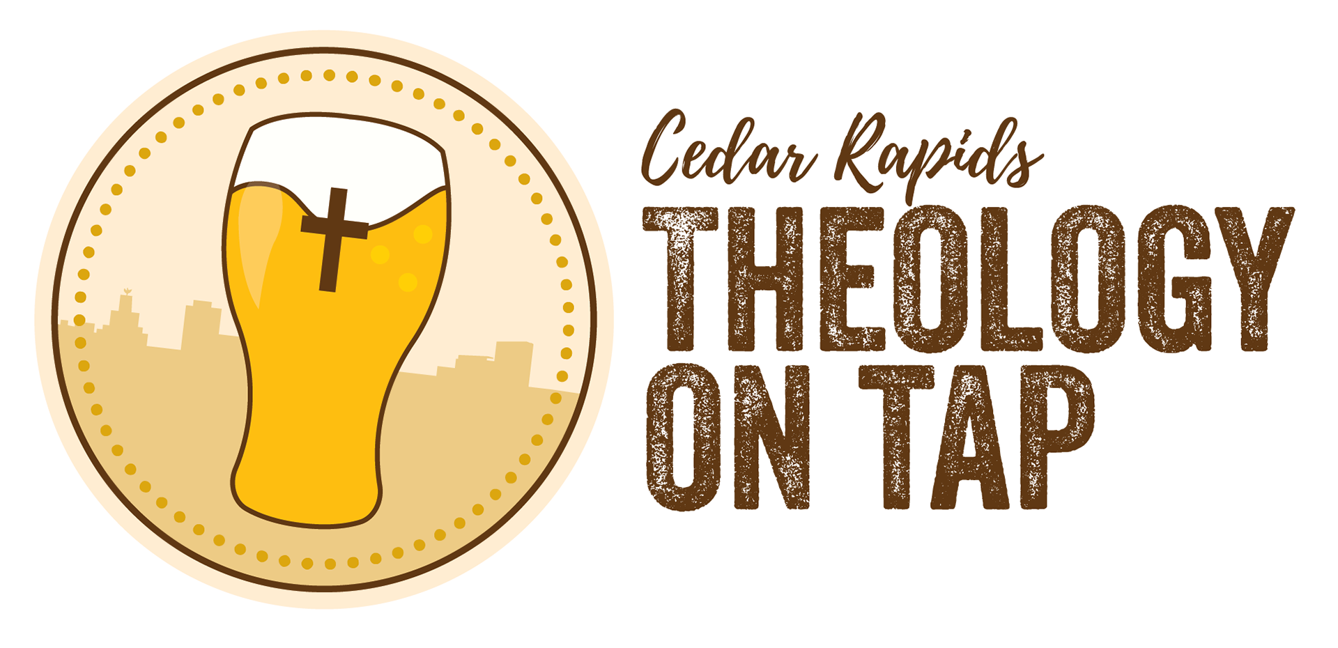
When coming back post-pandemic, Cedar Rapids Theology on Tap set out to refresh their logo and ensure consistency in their visual identity. Connor was invited on board to help with the refresh. Setting out to highlight three important and unique aspects about this specific organization, Connor crafted a logo that highlights (1) the local setting in the city skyline, (2) beer, and (3) most importantly the faith aspect of these events. Since implementing the new visual identity, Theology on Tap has seen an uptick in attendance at their monthly events.